MANIFESTO
HOSTEL & SUITES
The concept behind this brand started gaining shape as we realized that the target for this hostel were mainly business men and conference speakers, aged between 30 and 50, that stayed for short periods of time.
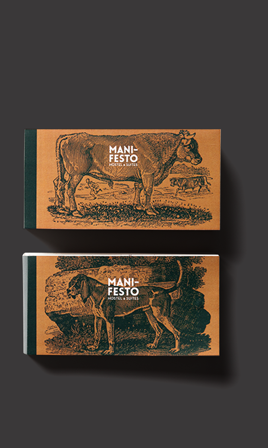
This should be a strong, practical and simple brand. The name should communicate this philosophy – “Manifesto” seemed appropriate as it is the quality of being obvious, evident and also a public declaration of principles. The double meaning of "Manifesto" enables us to enrich the identity of the hotel. With some sense of humor we created a public statement setting out what we believed to be the philosophy and the good practices for the hostel. The richness of the colors, the angles and curves well defined of the typography and the illustrations by Thomas Bewick add a revivalist nature to the identity. We did everything from logo, to packaging, signage, merchandising and added some surprises for the guests.
This should be a strong, practical and simple brand. The name should communicate this philosophy – “Manifesto” seemed appropriate as it is the quality of being obvious, evident and also a public declaration of principles. The double meaning of "Manifesto" enables us to enrich the identity of the hotel. With some sense of humor we created a public statement setting out what we believed to be the philosophy and the good practices for the hostel. The richness of the colors, the angles and curves well defined of the typography and the illustrations by Thomas Bewick add a revivalist nature to the identity. We did everything from logo, to packaging, signage, merchandising and added some surprises for the guests.


Developed at Horta studio.
2014
2014